MITH Graphs
For the next few weeks I’m helping out in Matt Kirschenbaum’s Critical Topics in Digital Studies where we will be taking a look at network analysis in the humanities. The plan is to provide a gentle introduction to the use of network analysis, aka graphs, in the digital humanities, while also creating a space to give the students some hands on experience using some tools. These working sessions are paired with discussions of a bunch of fun readings about algorithms, networks and platforms by Tressie McMillan Cottom, Benjamin Schmidt, Tarleton Gillespie, Jen Golbeck, Zeynep Tufekci, Nick Diakopoulos, Frank Pasquale as well as Alex Galloway & Eugene Thacker.
Thanks to a conversation with Miriam Posner, Thomas Padilla and Scott Weingart a few weeks ago I got some ideas for how this could work. Specifically Miriam’s idea of having the students assemble edge lists for networks that are relevant to them in Google Sheets, and then using Google Fusion tables to do some basic visualization followed by some more analysis and tuning of the visualization with Cytoscape. Miriam’s Cytoscape Tutorials are so lucid and useful I’m planning to just use them directly. I really appreciate that she took the time to make them available for use by other people.
So I wanted to create my own little demonstration dataset similar to how Miriam used films to learn my way around Fusion Tables and Cytoscape. Over a year ago MITH made its Research Explorer available, which is a small app that allows people to browse research projects from the last 10 years by sponsor, topic and time. One nice side effect of putting the JavaScript application together is that the project information that has been curated in Wordpress is also available as a single file of JSON.
So without too much work it’s possible to download that JSON file and then turn it into an edge list CSV file where column 1 is a project and column 2 is a person who was involved in the project. Then you can load it into Google Fusion Tables and with two clicks you are looking at a graph of that data:
It’s a little bit interesting, and it’s nice you can manipulate the graph … but it’s kind of a mess really. One thing that Miriam suggested doing is taking the two-mode graph (there are two types of nodes here: people and projects) and projecting it as two one-mode graphs: one of people and the other of projects. The people graph contains people who were associated because they have worked together on the same project. The graph of projects would contain projects linked together because some of the same people worked on them. Here’s what they look like:
As you can see they are much more interesting. The people one in particular shows MITH’s Director Neil Fraistat at the center. Also our designer Kirsten Keister who has been in MITH for a while, has worked with many different people over the years.
Miriam had the students use R to do this projection, using a small helper function that Matt Lincoln wrote. But I’ve been meaning to learn more about Python’s igraph so I took it as opportunity to learn how to do it. It’s not as elegant’s as Matt’s code, but it works. I think I may turn it into a little microservice so the students can just use the browser to do the transformation.
The next step for the class is going to show how to take the same edge list and load it into Cytoscape where the graph can be manipulated a bit more. Specifically it’s possible to use the number of times people collaborated together as edge weights, and to use that weight to change the appearance of the edge. In this example I used the weight to make the edge thicker. I also had Cytoscape analyze the graph which provided each node’s degree or the number of edges for each node. Using Miriam’s notes it’s clear how to adjust the size of the node based on the degree. This has the effect of making more connected nodes larger.
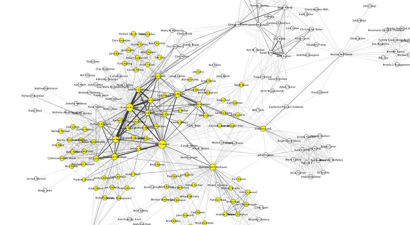
It’s not really very legible here, but in Cytoscape it’s easy to zoom in and see that there was a cohort of people who did lots of work together: Trevor Muñoz, Kirsten Keister, Jennifer Guiliano, Amanda Viscontin, Travis Brown, James Smith and Neil Fraistat. You can also see bridging people like Ben Schneiderman who brought in people from outside of MITH’s usual collaborators. If you are interested and have Cytoscape you can find the cys file here. The nodes colored in yellow were selected because they were all people who had worked directly with Neil.
If you have ideas or comments about any of this I’d enjoy hearing them either here or @edsu.